What data is shown in the reports and how to drill down and find problem areas that neen to be adressed.
Once enough data is gathered to generate a report, the Program Administrator and Managers will receive an email notification! They will have access to the Pulse Survey dashboard.
Note: if there isn't enough data accumulated, the panel will be grey and say “more data is needed to show statistics.”
A high-level snapshot of the results
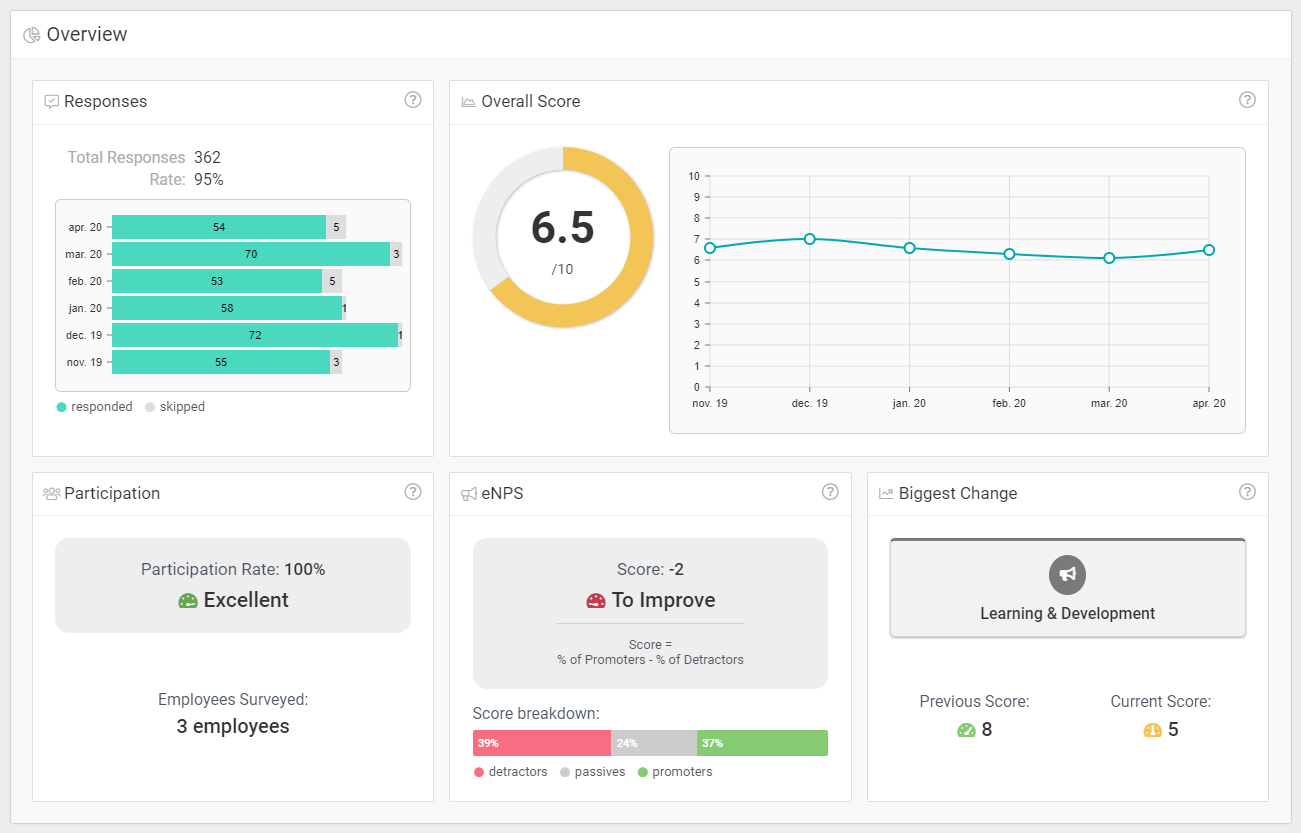
The first panel is the overview of their company’s Pulse Surveys results. This panel is meant to give the administrator a quick view of the health of their company.
Note: Scores are based on the designated time period. You can filter by preset periods (example, last week, last month, last 30 days, etc) or by a custom date.
How each score is determined
- Responses: This is the total response rate of the surveys with a breakdown of responses vs skipped questions for each month.
- Overall Score: This high-level score is calculated as an average of the scores for ALL themes (excluding the eNPS). It's a good measure of the overall health of employee engagement in your organization.
The related graph shows the change of this Overall Score over time by plotting the individual scores for each month. - Participation: This is the number of employees who answered, expressed as a percentage.
- eNPS: This score is based on the eNPS questions being asked in each set of 5 questions to each employee.
Note: eNPS is a method of measuring how willing your employees are to recommend their workplace to their family or friends.
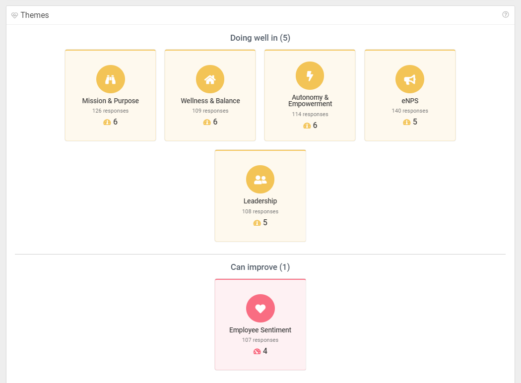
Which areas of employee engagement can be improved in your company?
In the second panel, you can quickly see which themes (i.e. components of employee engagement) are strong in your organization.
For example, perhaps your employees are very satisfied in terms of "recognition and rewards" but they are less satisfied in terms of "mission and purpose."
- Green: Indicates that component of engagement is "doing good!"
- Yellow: That component is good, but could use improvement.
- Red: That component of engagement needs improvement.
Drilling down: Insights for each theme & questions
Each card can be clicked on to access more insights for that theme.
Note: These insights can help you understand why a particular theme "needs improvement."
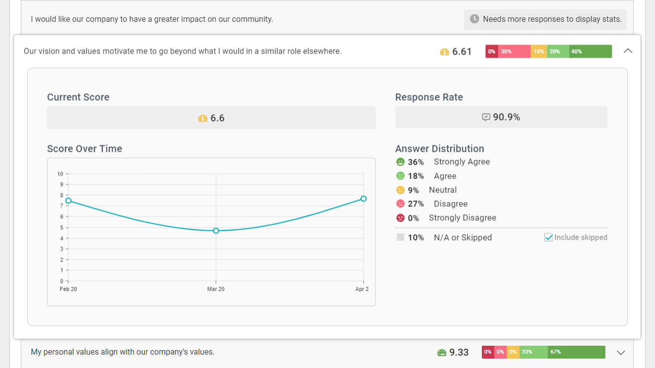
The panel which gives you an overview of an individual theme is similar to the Pulse Surveys overview above.
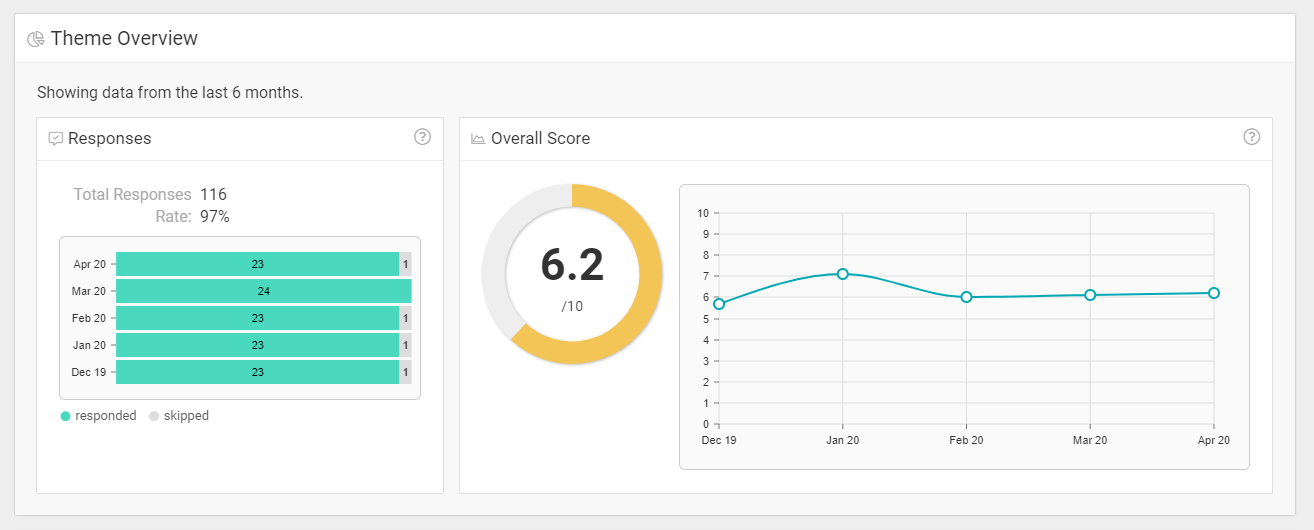
In this theme-specific report, you can gain a deeper understanding of how the questions (within that theme) are performing.
These insights help you understand detailed results, such as:
- Which specific questions are being skipped?
- Which specific questions have a low answer rate.
- Which specific questions yield low scores.
- Which specific questions yield mixed results.
As you can see, in the second panel, each question has an individual breakdown with the answer distribution, score, participation rate and score over time.